Welcome to Oveit! If you’re using our Hub plan, you’re empowered with advanced customization options to make your event registration widget truly reflect your brand’s identity. This tutorial will walk you through the steps to modify the widget’s color scheme, ensuring it seamlessly integrates with your brand’s aesthetics.
Step 1: Access the Default Embed Code
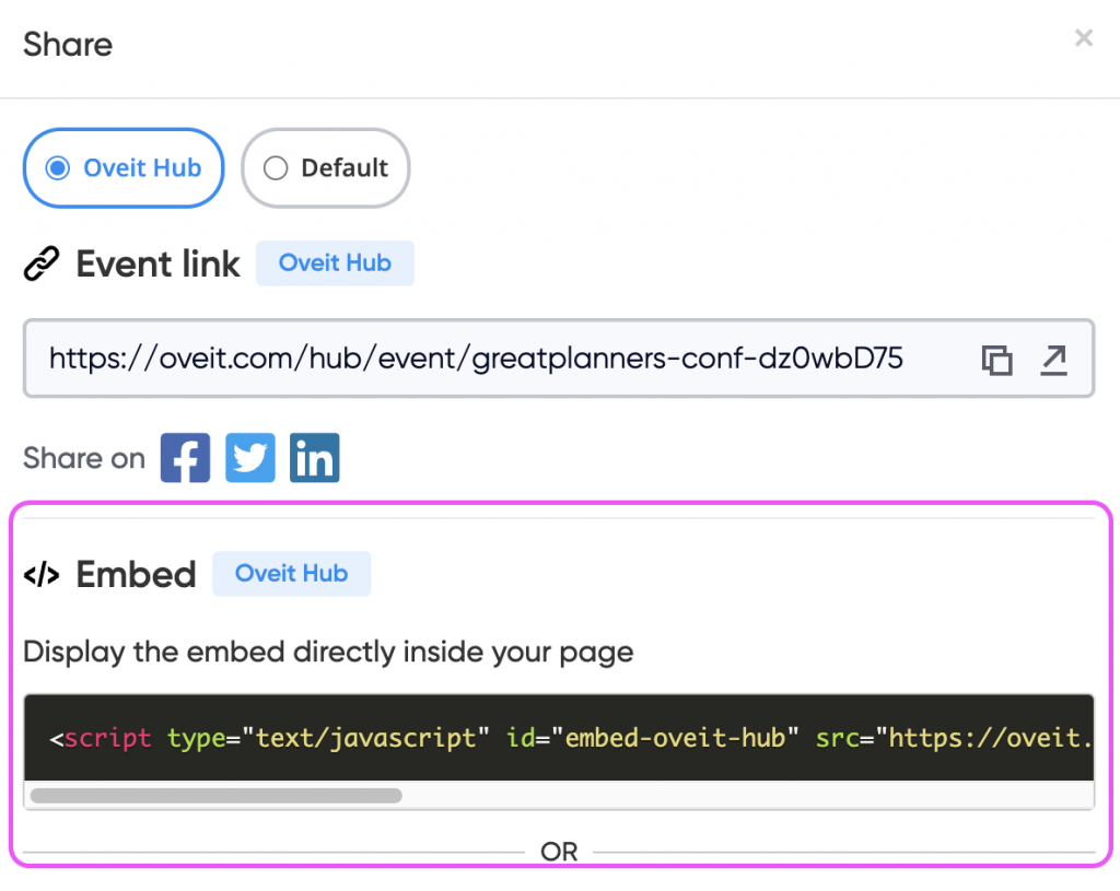
To start customizing your event registration widget, you’ll first need to access the default embed code provided by Oveit. This code is the base that you’ll tweak to align with your brand’s colors. You can find it by pressing the “Share” button in your Oveit events section:
Step 2: Understanding the Default Color Scheme
Before you start making changes, it’s essential to understand the default color scheme Oveit uses. The default colors include various shades of neutrals, blues, greens, reds, and oranges. Here’s a breakdown of the available options:
- Neutral Colors:
--neutral-0: #FFFFFF;(White)--neutral-10: #F8F9FC;--neutral-20: #F2F4FB;--neutral-40: #ECEEF3;--neutral-200: #DBDDE2;--neutral-400: #C3C7CF;--neutral-600: #878B99;--neutral-800: #595D6B;--neutral-1000: #050E26;(Dark Blue)
- Blue Colors:
--blue-10: #F3F9FF;--blue-20: #E5F1FE;--blue-1000: #178AF5;(Primary Blue)
- Green Colors:
--green-10: #E3FFE8;--green-1000: #19B934;(Primary Green)
- Red Colors:
--red-20: #FBDFDD;--red-40: #FFCCC9;--red-1000: #E12117;(Primary Red)
- Orange Colors:
--orange-40: #FDE7BD;--orange-1000: #E39B10;(Primary Orange)
These are the default values that you can customize to better match your brand’s colors.
Step 3: Tweaking the Color Scheme
If you wish to use your brand’s colors, you can do so by tweaking the widget’s color scheme directly in the embed code. Here’s how:
- Copy the Default Embed Code: Start by copying the embed code you received from Oveit.
- Add the
data-colorsAttribute: You’ll modify the copied code by adding thedata-colorsattribute to the<script>tag. This attribute will allow you to specify your custom colors. - Specify Your Custom Colors: Replace the default color values with your brand’s colors within the
data-colorsattribute.
Here’s an example of how a customized embed code might look:
<script data-colors=”–bodyBackground: linear-gradient(135deg, rgba(2,0,36,1) 0%, rgba(16,47,77,1) 0%, rgba(26,61,81,1) 100%);
–cardTitleBackground: linear-gradient(to right, #00249C, #03123E);
–cardContentBackground: linear-gradient(135deg, rgba(2,0,36,1) 0%, rgba(16,47,77,1) 0%, rgba(26,61,81,1) 100%);
–cardFooterBackground: linear-gradient(135deg, rgba(2,0,36,1) 0%, rgba(16,47,77,1) 0%, rgba(26,61,81,1) 100%);”
type=”text/javascript” id=”embed-oveit-hub” src=”./embed-script-hub.js”
data-oveit-hub-link=”https://oveit.com/hub/event/test-event-G7dW9QnE/buy-tickets”></script>
In this example:
- The primary blue color (
--blue-1000) has been changed to#06D6A0. - Another shade of blue (
--blue-20) has been updated to#43BCCD. - The lightest neutral color (
--neutral-0) is now#073B4C. - The darkest neutral color (
--neutral-1000) has been changed to#FFD166.
This is how it would look like with these basic changes. Not necessarily pretty but you can see the changes:
Feel free to adjust any or all of the color variables to align with your brand’s color palette.
Step 4: Adding Gradient Backgrounds
Beyond customizing the color scheme, Oveit also allows you to enhance the visual appeal of your event registration widget by incorporating gradient backgrounds. Gradients can add depth and a dynamic look to your widget, making it more engaging for your users. Below, we’ll guide you through how to configure gradient backgrounds for different parts of the widget.
Available Gradient Customizations
You can apply gradients to various elements of the widget by specifying them within the data-colors attribute. Here are the key elements you can style with gradients:
--bodyBackground: This controls the overall background of the widget.--cardTitleBackground: This defines the background of the title section within cards (like ticket options).--cardContentBackground: This sets the background for the main content area of the card.--cardFooterBackground: This applies to the footer area of the card, often where actions or prices are displayed.
Example Gradient Configurations
Let’s walk through an example where we apply gradient backgrounds to various parts of the widget. Here’s how the configuration might look:
<script data-colors=”–bodyBackground: linear-gradient(135deg, rgba(2,0,36,1) 0%, rgba(16,47,77,1) 0%, rgba(26,61,81,1) 100%);
–cardTitleBackground: linear-gradient(to right, #00249C, #03123E);
–cardContentBackground: linear-gradient(135deg, rgba(2,0,36,1) 0%, rgba(16,47,77,1) 0%, rgba(26,61,81,1) 100%);
–cardFooterBackground: linear-gradient(135deg, rgba(2,0,36,1) 0%, rgba(16,47,77,1) 0%, rgba(26,61,81,1) 100%);”
type=”text/javascript” id=”embed-oveit-hub” src=”./embed-script-hub.js”
data-oveit-hub-link=”https://oveit.com/hub/event/test-event-G7dW9QnE/buy-tickets”></script>
Explanation of the Example
- Body Background:
--bodyBackground: linear-gradient(135deg, rgba(2,0,36,1) 0%, rgba(16,47,77,1) 0%, rgba(26,61,81,1) 100%);- This gradient moves at a 135-degree angle, blending from a deep navy blue (
rgba(2,0,36,1)) to a slightly lighter blue (rgba(26,61,81,1)).
- Card Title Background:
--cardTitleBackground: linear-gradient(to right, #00249C, #03123E);- This gradient flows horizontally (to the right) from a rich blue (
#00249C) to a darker shade (#03123E).
- Card Content Background:
--cardContentBackground: linear-gradient(135deg, rgba(2,0,36,1) 0%, rgba(16,47,77,1) 0%, rgba(26,61,81,1) 100%);- Similar to the body background, this gradient ensures continuity across the card’s main content area.
- Card Footer Background:
--cardFooterBackground: linear-gradient(135deg, rgba(2,0,36,1) 0%, rgba(16,47,77,1) 0%, rgba(26,61,81,1) 100%);- The footer background matches the content area and body, creating a cohesive look.
Step 5: Applying and Testing Your Gradient Configurations
After customizing the gradients, integrate the updated embed code into your website. Test the widget across different devices and screen sizes to ensure that the gradients render beautifully and consistently.
Conclusion
Customizing your event registration widget’s colors is a powerful way to maintain brand consistency across all aspects of your event. With Oveit’s Hub plan, you can easily tweak the widget’s color scheme by following the steps above. Whether you choose to stick with the default colors or apply your unique brand palette, Oveit ensures that your event registration process is as stylish as it is functional.
Happy customizing!