Hey y’all, event planners and all you event enthusiasts out there, hold onto your event registrations because Oveit has a fantastic facelift in the events listings section. Let’s dive in and see why the new event listings are a big improvement for all you event aficionados.
1. Clarity reigns supreme:
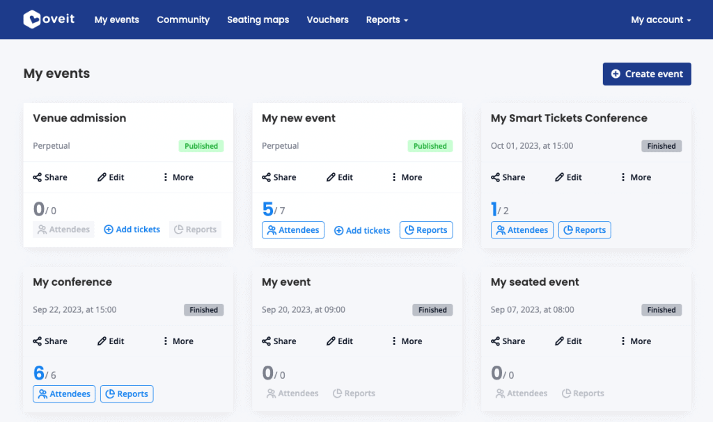
Imagine scrolling through your event dashboard and getting hit with a barrage of data that leaves you feeling like you’re reading the Matrix. Yup, that was Oveit until this week! Now your events’ relevant stats are easier to scan than your grocery list. We’ve trimmed the fat, removed the redundant, and served you a clean plate of event information. So, no more playing hide-and-seek with critical details!
2. Action-packed interface:
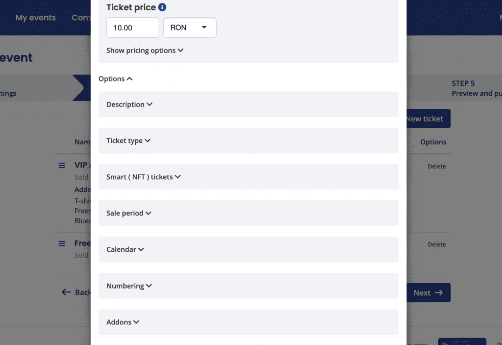
The goal for our new design is to put the spotlight on the actions you want to take – whether it’s editing your event, checking the number of attendees (because we all want to know if it’s going to be a rager or a snoozer), sharing your event on social media to let the world know it’s going down, or adding those precious tickets at the registration desk.
3. More info, less scrolling:
Our UX wizards have waved their magic wand and transformed the event listings from an inline display to a sleek column and row system. More information at your fingertips, and less scrolling means you’ll save more time for things that matter, like selecting the best speakers, making sure visitors get a fun experience and you get peace of minds.
4. Mobile first makes it easier to stay connected:
Let’s face it, mobile devices are practically our best friends, and we know it. The new event listings are optimized for mobile viewing, so you can plan events while you’re waiting in line for your morning coffee. Your events are now truly at your fingertips, wherever you go!
5. Reports, reports, and more reports:
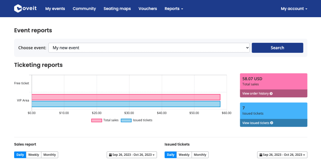
You know those full event reports that you’ve been sifting through, desperately searching for a golden nugget of information? Well, we tried to help and moved them to a dedicated ‘event reports‘ section. It’s like moving from a cluttered attic to a swanky penthouse – spacious, organized, and oh-so-sophisticated. Plus, it sets the stage for more amazing future event reporting features.
6. Clean and clear:
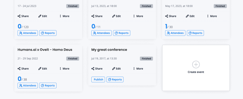
We revamped the look and feel of events, creating a clear distinction between active, archived, and permanent events. With tags like ‘Published,’ ‘Draft,’ and ‘Finished,’ you’ll always know where your event stands. It’s like having a butler at your service, only virtual.
7. Create your next dream event:
You’re at the end of your event listings, and what do you see? A big, bold, “create event” button beckoning you to let your creativity run wild. At Oveit we are all about making your event planning dreams come true, and this button is the gateway to your event wonderland. So go ahead, click it, and make magic happen!
Alright, ready to test the new flow? Head over to your events section and see how it feels.