… but just as powerful and feature packed.
As Oveit progressed we added more and more features. We started with a simple idea of making event registration simpler, help event organizers receive payments instantly and embed everything on their website.
As we progressed and crossed our first thousand users we saw more and more options we needed to add.
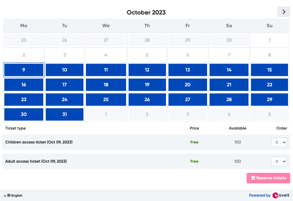
We understood different registration periods may have different pricing points. We saw the need to limit potential sales to an upper limit of tickets per buyer (avoiding scalpers and such). We then discovered the whole idea of group buying and we added bulk sales options. Some of our customers wanted to extend the usage of a simple ticket beyond just access and we created addons. We even added a digital wallet you can use to pay for goods in a venue and around it. To solve fraud we created smart tickets. Calendar based tickets were added to cover multi-day events. And more…
So, inch by inch, we got to this:
And this …
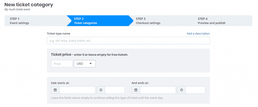
And a lot longer setup section. I just cropped the upper part. Imagine you had to scroll to find the save button on a ticket. On a desktop.
Meanwhile, most of our starting users wanted to set up a ticket or two, set up a price and start their event registration.
The power users, midsized and large events, needed the full range of our features and sometimes even more.
So how could we have our cake and eat it too? How can we set up a simple basic ticket setup option but retain all of our features?
We thought a lot about this and discovered that:
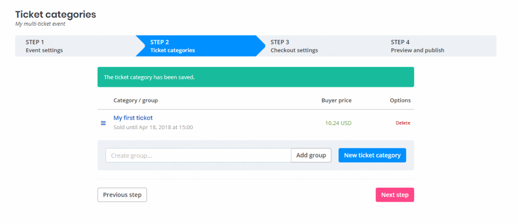
- We needed to simplify the ticket listing page and minimize the ticket groups feature. So we removed the large group input which served a minimal role. We updated the interface for our users to just drag and drop tickets and it would form a group. We changed the wording based on input from our customers;
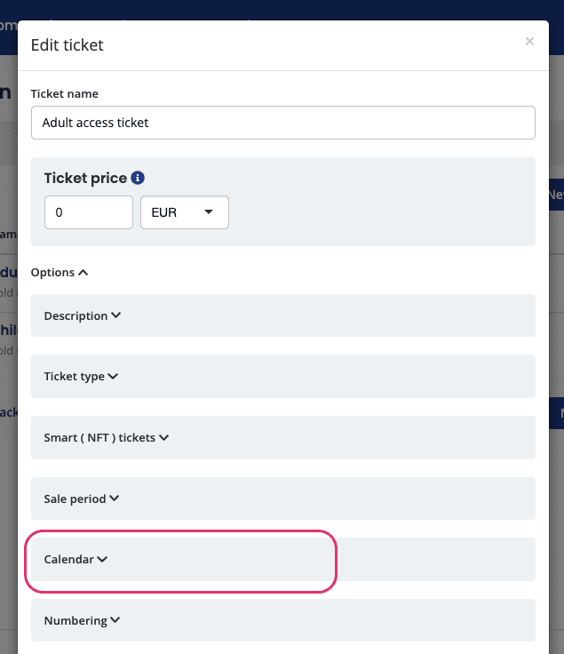
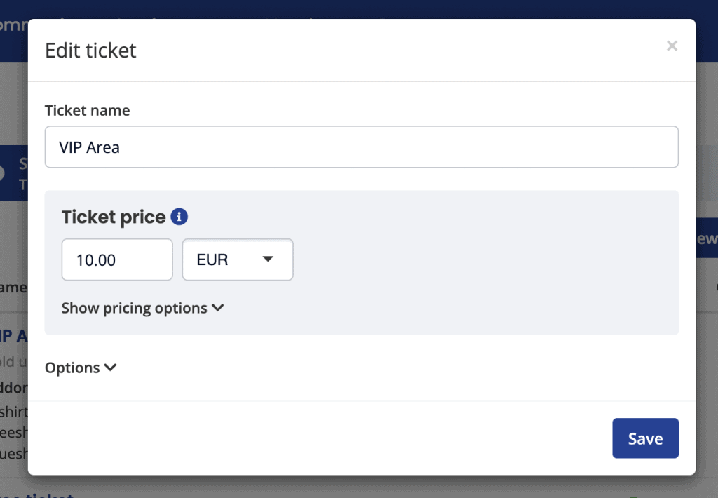
- We kept only the minimal options visible in the basic ticket setup. We now ask for a ticket name and a price (if the registration is not free). All other (many) options are now part of the … well … options panel. Just expand it and you’ll see them ordered by most commonly used ones.
This is how the ticket listing section looks now:
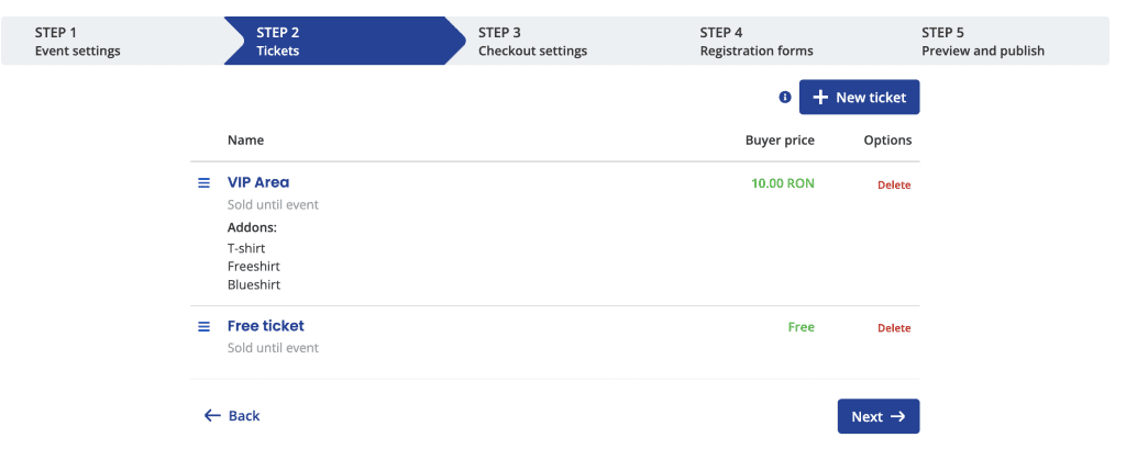
And this is how the ticket setup modal looks like:
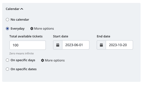
The expanded options are visible at a click or two:
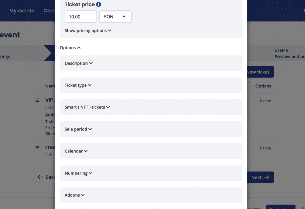
Much easier to follow, right? If you want to play around with it just head over to your Events section and add a new ticket.
We’d love to hear your take on it. If there’s anything you think we can improve, just schedule a call with us here.
